

Workshop two of five. Steps up from the bar chart to three overlapping series — where vision LLMs swap series and produce confidently wrong output. Calibrated handles it the same as a single line: one series at a time.
The practice chart
Open this chart in DataFromChart →
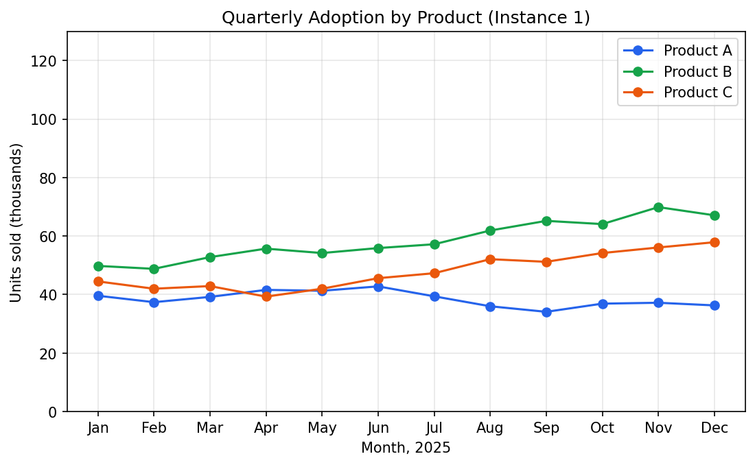
Three product lines (A blue, B green, C orange) monthly over a year. 36 points. Y-axis “units sold (thousands)” 0-130; x-axis Jan-Dec.
Target: three series, twelve (month, value) pairs each.
The trick: extract one series at a time
Finish one series completely before starting the next. All twelve Product A points first, then Product B. Don’t interleave.
Why: with all series in one extraction, it’s easy to lose track of which point belongs to which — especially at crossings. The data layer can’t separate them after the fact.
DataFromChart supports per-series extraction natively: three series, series name as label.
Step 1: open and classify (CHART → PREPARE)
Open the chart, then click Next to PREPARE. Pick the chart type (line) and set the axis value types — x is numeric (months 1-12), y is numeric. Advance.
Step 2: calibrate the axes (AXES)
Click Next to AXES — calibration only. Y-axis: 0 at the bottom gridline, 120 near the top. X-axis: Jan (month 1) and Dec (month 12), or skip x-calibration if you’ll re-label by month name in the export. Calibrate once here; the axes apply to every series you plot next.
Step 3: place Product A points (POINTS)
Click Next to POINTS and create a series “Product A”. The app defaults to blue — usually matches.
Click each of the twelve blue-line points left to right. Zoom in — land on the marker.
Twelve clicks. Blue points should sit on top of the blue data.
Step 4: repeat for Products B and C
Create “Product B”. Twelve green-line points. Then “Product C”, twelve orange. Don’t re-calibrate — axes apply to all series.
Total: 36 clicks, one calibration pass, three named series.
Step 5: export
XLSX or CSV. All 36 points with series names in long format:
series,month,value
Product A, Jan, 31.2
Product A, Feb, 36.0
...
Product B, Jan, 42.4
...
Long format is what Plotly, ggplot, and Vega-Lite prefer.
Answer key
Ground-truth values:
| Month | Product A | Product B | Product C |
|---|---|---|---|
| Jan | 39.6 | 49.8 | 44.5 |
| Feb | 37.4 | 48.8 | 42.0 |
| Mar | 39.2 | 52.8 | 42.9 |
| Apr | 41.6 | 55.7 | 39.3 |
| May | 41.3 | 54.2 | 42.0 |
| Jun | 42.8 | 55.9 | 45.6 |
| Jul | 39.4 | 57.2 | 47.3 |
| Aug | 36.0 | 61.9 | 52.1 |
| Sep | 34.1 | 65.2 | 51.2 |
| Oct | 36.9 | 64.1 | 54.2 |
| Nov | 37.2 | 69.9 | 56.1 |
| Dec | 36.3 | 67.1 | 57.9 |
Per-series MAE. Aim for under 1.5. Above 3 = calibration drift; above 5 with no calibration issue = a point on the wrong series, usually at a crossing.
Common mistakes
- Swapping series at crossings. When blue and green cross around May, it’s easy to click the green line while extracting Product A. Named groups make this visible — a Product A point on the green line is an obvious mismatch. Re-check at crossings.
- Forgetting to switch active series. Clicking while “Product A” is still active adds to Product A. Check the active series label before each set.
- Inconsistent x-positions across series. All three should share x-positions per month, but eyeballing “Jan” differently each time misaligns your Jan values. Zoom in on the month’s tick line, or use the arrow-key nudge to align each point’s x to the same column, if precision matters.
How this compares to AI
Multi-series is where AI fails most visibly. In our testing:
- Claude Sonnet 4.6: swapped series in nearly half the months.
- GPT-4o: consistently swapped on the B/C crossing.
- Gemini: similar series-tracking errors.
All three could name the series from the legend. None could reliably tie a name to the right line at each x. Per why AI gets chart data wrong: tracking lines through crossings needs sustained spatial reasoning vision encoders aren’t built for.
Calibrated extraction beats all three by a wide margin in ~8 minutes.
Next
- Workshop 3: Dense Scatter Plot with Auto-Extract — 250 points in 90 seconds with color-based auto-extraction.
- Workshop 4: Log-Scale Chart Without Arithmetic Mistakes — log axes, the failure mode AI never solves.
- All five workshops + practice datasets — full hub.
Try it on your own chart
Upload an image, click your data points, calibrate the axes, and export CSV. Under three minutes, no login required for a single export.
Open the extractor

