

Workshop one of five. Synthetic 5-bar chart with known ground-truth values — extract, then compare against the exact answer to grade yourself. Fastest way to learn the workflow.
New to chart extraction? Start here. Already comfortable? Skip to workshop two (multi-series line) or workshop three (dense scatter).
The practice chart
Open this chart in DataFromChart →
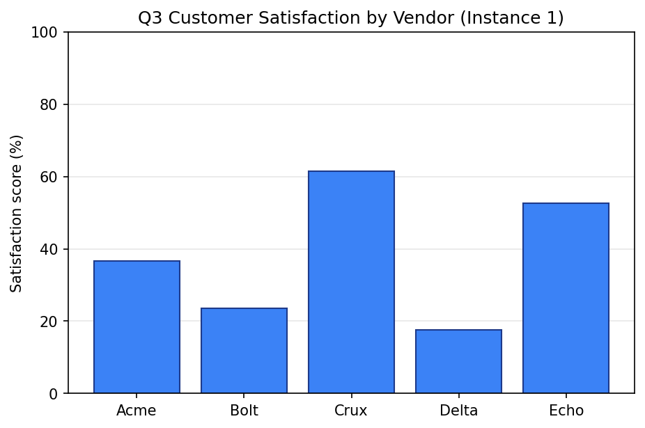
Satisfaction scores for five fictional vendors. Y-axis 0-100%, clean gridlines, distinct bar tops. Easiest case.
Target: one (vendor, score) pair per bar. Five values.
Step 1: open the chart
Click “Open in DataFromChart” above — the chart loads with the five steps ready: CHART → PREPARE → AXES → POINTS → DATA. You’re on CHART.
Or upload manually: right-click the image, save, upload at datafromchart.com/extract.
Step 2: classify it (PREPARE)
Click Next to PREPARE. Pick the chart type — this is a column chart (vertical bars). PREPARE is also where you set each axis’s value type: the x-axis here is categorical (the five vendors), the y-axis numeric. Set those and advance.
Step 3: calibrate the axes (AXES)
Click Next to AXES. Because x is categorical, you only calibrate the numeric y-axis: drag the lower calibration line to y = 0 and the upper to y = 100, and enter 0 and 100. For the categorical x-axis you drag the category-center lines — the app shows a read-only “Categories: 5”.
Two clicks, two numbers.
Step 4: place points (POINTS)
Click Next to POINTS. Click once at the top of each bar — at the midpoint of the top edge. The cursor snaps to the clicked pixel; drag to nudge if you miss.
Five clicks, one per bar. The y-values come from the calibration you just set. Just put each point visually on top of its bar.
Pro tip: zoom in before clicking. The pixel difference between “on the top” and “one above” is small but real.
Step 5: read the data (DATA)
Click DATA. The app shows calibrated y-values:
Acme:  37.2
Bolt:  23.8
Crux:  61.9
Delta: 17.4
Echo:  52.9
Your numbers won’t match exactly — they depend on where you clicked. Aim for ±1.5 per value (≈1.5% MAE), the “clean chart, careful operator” target.
Export as CSV or XLSX. XLSX embeds the original chart so reviewers can verify visually. See chart screenshot to Excel.
Answer key
Ground-truth values:
| Vendor | True value |
|---|---|
| Acme | 36.6 |
| Bolt | 23.5 |
| Crux | 61.5 |
| Delta | 17.5 |
| Echo | 52.7 |
Average the absolute differences. MAE under 1.5 (≈1.5% of the y-range) means you’ve nailed it. MAE above 3 usually means calibration is off — re-position lines on the actual gridline pixels.
Common mistakes
- Calibration line off the gridline. Biggest source of error. “Around y = 0” instead of exactly on it propagates to every point. Zoom in for calibration.
- Clicking the middle of the bar instead of the top. The top is the value; the middle is half. The app reads where you clicked, not what you intended.
- Forgetting to enter the axis numbers. Dragging lines to the right positions doesn’t help if value boxes still say
0and1. Check both halves.
How this compares to AI
We sent this exact chart to ChatGPT, Claude, and Gemini — even the best model (Claude Sonnet 4.6) was off by enough to matter on average — usable for “which bar is tallest” but not downstream analysis. Calibrated extraction beats that by an order of magnitude with five minutes of practice.
Same pattern across chart types: AI is fast and rough, calibrated is slower and precise. See AI chart extraction vs calibrated digitization.
Next
- Workshop 2: Multi-Series Line Chart with a Legend — three series, twelve months.
- Workshop 4: Log-Scale Chart Without Arithmetic Mistakes — the chart type that breaks AI most reliably.
- All five workshops + practice datasets — full hub.
Try it on your own chart
Upload an image, click your data points, calibrate the axes, and export CSV. Under three minutes, no login required for a single export.
Open the extractor

